ACE Responsive Site Redesign | Chelsea Watson, UX Designer
Explore the American College of Education 4x4 - an extensive redesign strategy developed by four people in four weeks. Chelsea Watson lead UX on the project by offering strategic insight, establishing customer journeys, auditing the existing site, and creating responsive wireframes and prototypes.

American College of Education
American College of Education (ACE) is a for-profit institution offering advanced education options online for teachers. Based in Indianapolis, Indiana, ACE delivers affordable master's, doctorate and specialist degree programs, and graduate-level certificates in Education.

The Challenge
We were approached by ACE to reimagine their digital prospect experience. The catch? Before going ahead with the redesign, our clients needed us to help them convince their bosses that it was worth the investment. And we only had four weeks to do so.

The Process
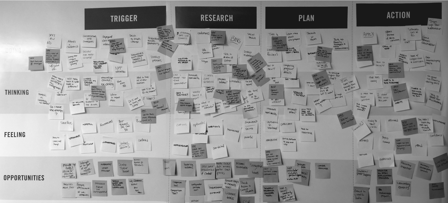
Kicked off by a day-long Rapid Design Lab with the clients, I spent those four weeks working closely with the Art Director, Strategist and Tech Lead to sketch concepts, audit competitors, talk to users, build customer journeys and brainstorm ideas.

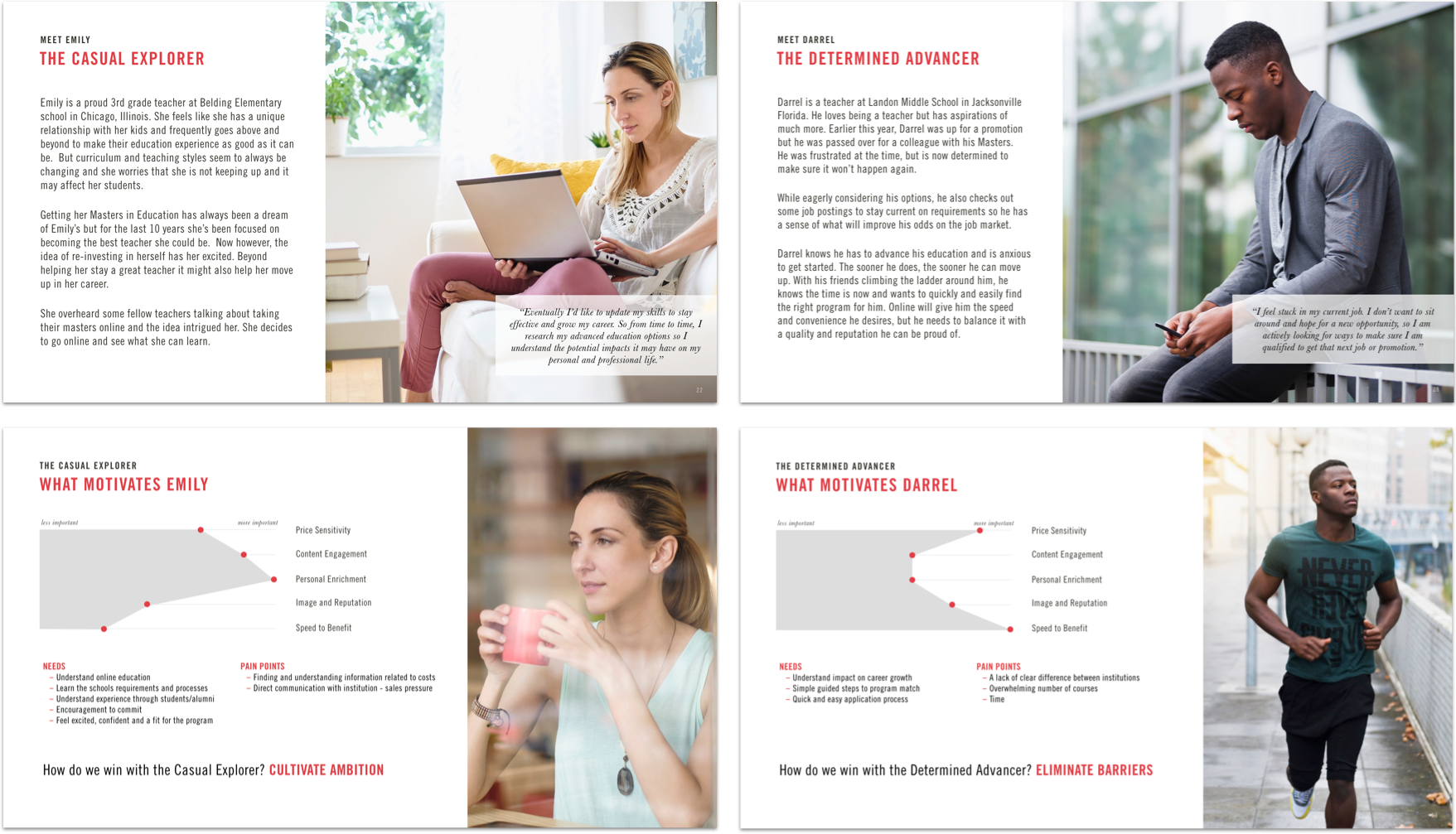
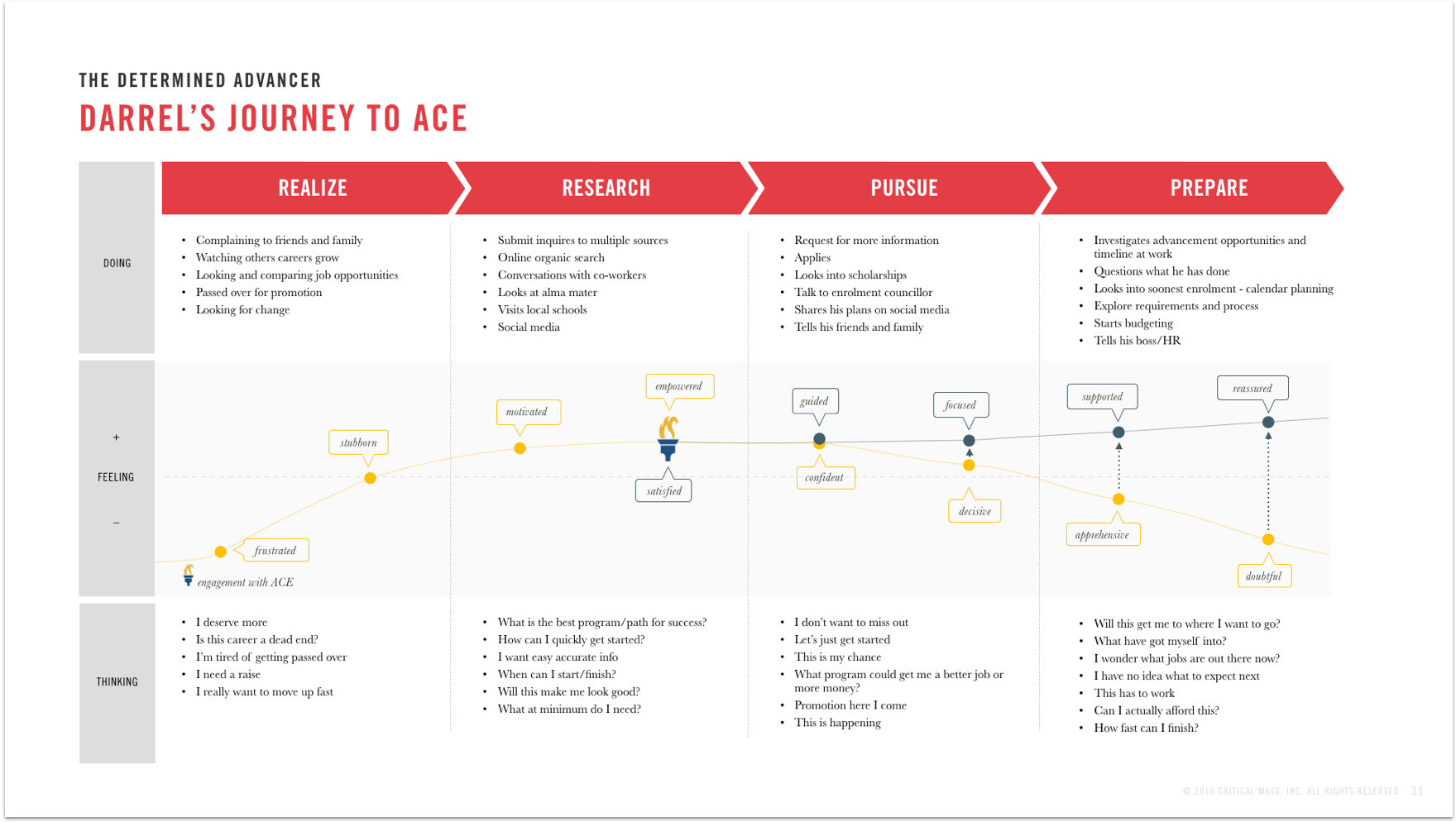
ACE Personas & Customer Journeys
Our personas were based on existing analytics and audience research. Once we had established their key motivations, we were able to map their primary journeys and interactions with ACE to determine the key areas of the site we’d be focusing on for our redesign.


Excerpt from our Digital Strategy

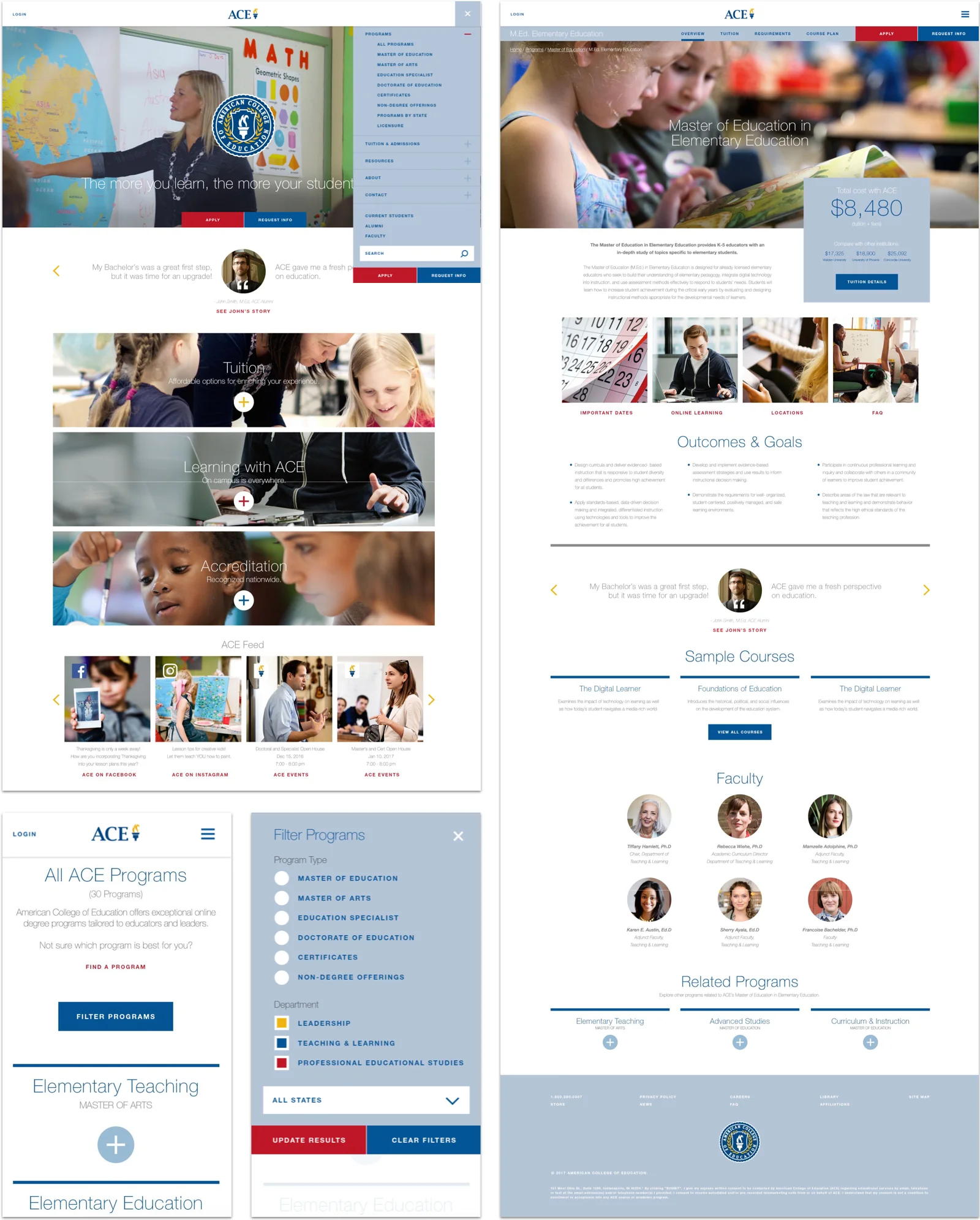
ACE Redesign
Once we’d established the key touch points for the ACE experience, I performed a heuristic audit of the existing site to determine where improvements could be made. From there, I created wireframes and worked closely with the Art Director to determine page layouts, navigation systems and overall look and feel.


The Solution
Our responsive site design was rooted in the goals of ACE’s users, leaning on e-commerce models to help inspire and guide prospective students to the purchase path. Our clients loved it. Their bosses were sold. And Critical Mass was hired not only to go ahead with our vision, but also to assist with ACE’s digital marketing efforts.

Credits
Client
American College of Education
Agency
Critical Mass
User Experience
Chelsea Watson
Art Direction
Carl Lukasewich
Strategy
Chris DeVuono
Tech Lead
Ryan Johnston
Marketing Science
Wilson Tsang
