AT&T E-Commerce & Buy Flow | Chelsea Watson, UX Designer
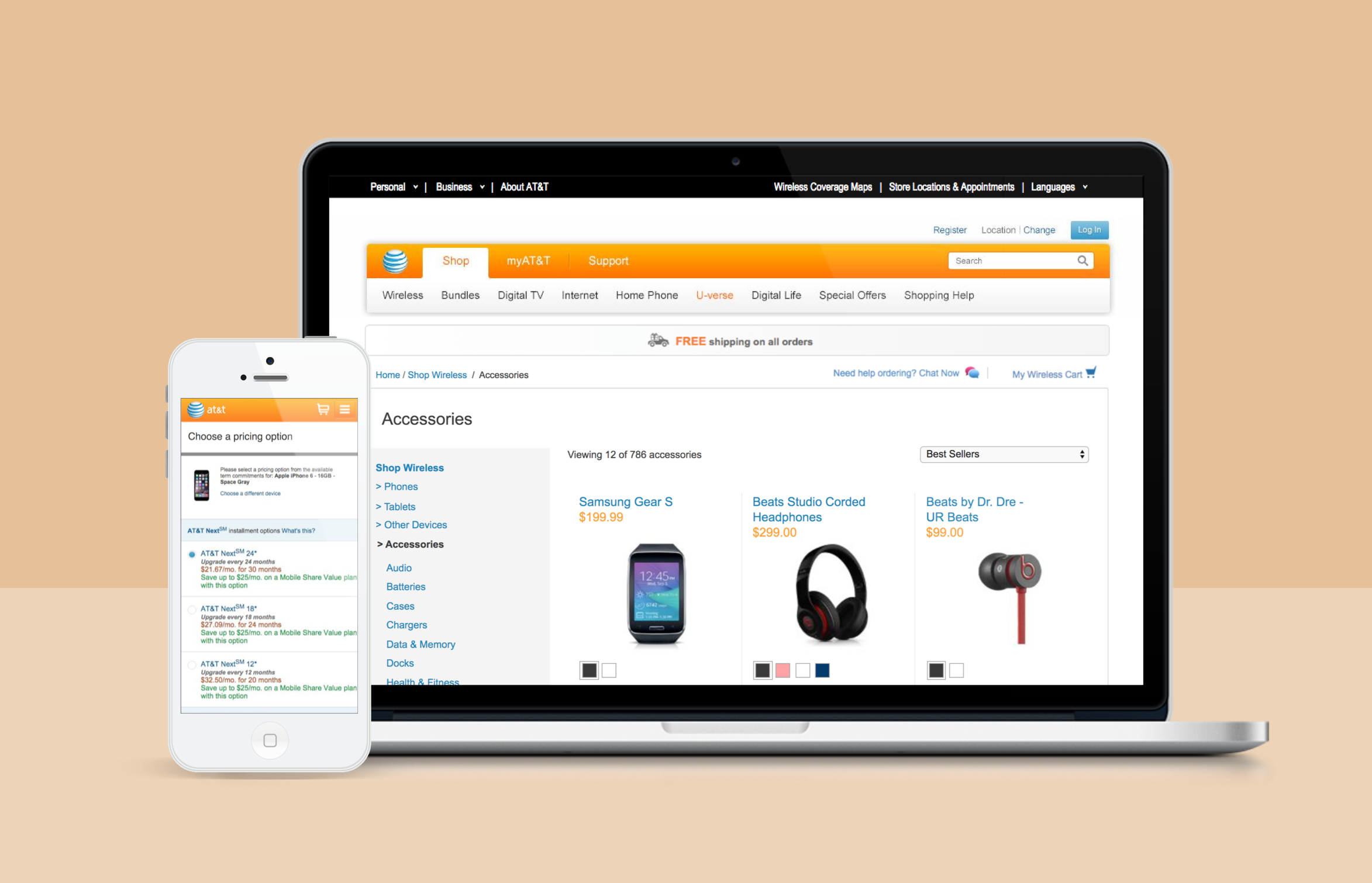
View pieces from my time on the AT&T Experience Planning Team, during which I provided wireframes, user flows, prototypes and overall digital strategy. Projects include various shopping tools, optimized product listing pages, and a long-term future vision for the AT&T digital shopping experience.

AT&T E-Commerce & Buy Flow
I spent the better part of a year working with the AT&T Digital Experience Planning Team to optimize and refine various painpoints within the existing e-commerce buy flow and to design a forward thinking online shopping vision rooted in digital trends, customer data and personalization.
Wireline Buy Flow
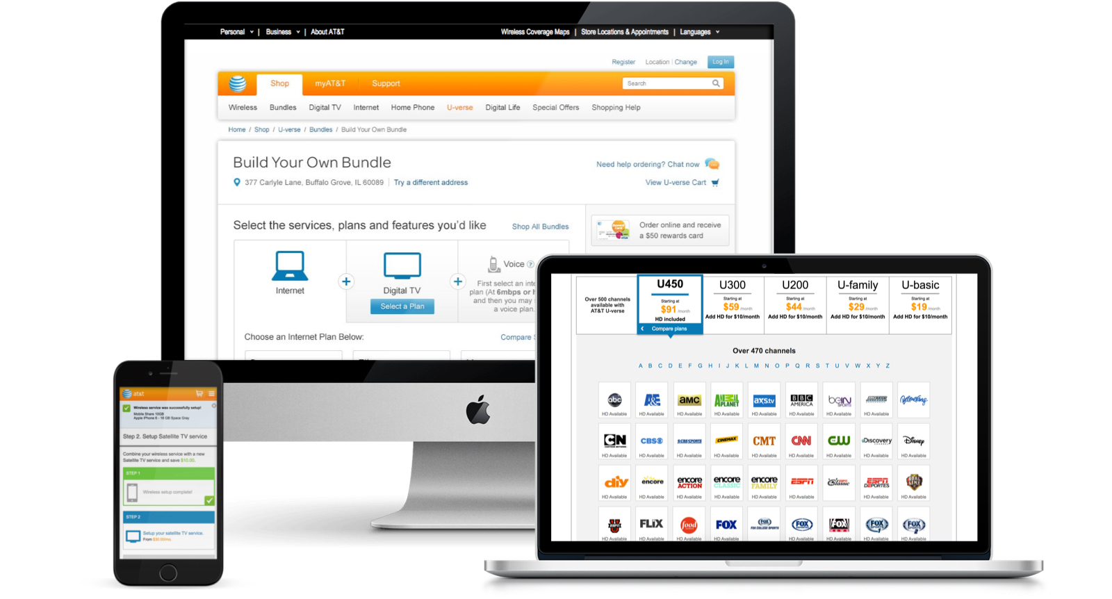
The AT&T wireline buy flow allows customers to make decisions regarding the purchase of home phone, internet and TV services. I explored various shopping tools within the buy flow that would help make it easier for customers to determine which products were right for them including a Help Me Choose tool and a robust Channel Lineup compare. These projects entailed extensive iterating, prototyping and testing of both mobile and desktop solutions.
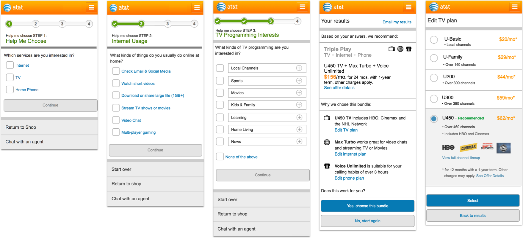
Help Me Choose & Channel Lineup Tool Mockups
Product Listing Redesign
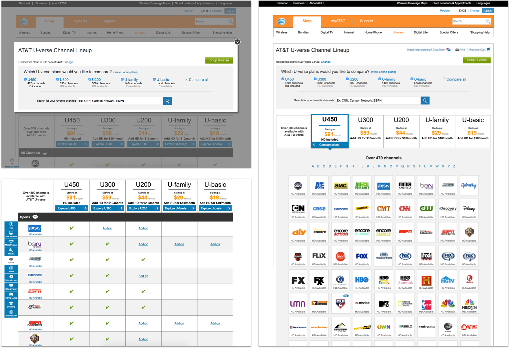
To further improve the AT&T e-commerce experience, I worked to optimize the product listing page by suggesting a solution that would integrate all physical products into one cohesive shop experience. I explored many different options and designed, prototyped and tested three variations of the listing page and filtering system. User testing dictated that the more traditional approach was the clear winner in browsing and finding a particular product (option 1, below).

Option 2

Option 3

AT&T E-Commerce Vision
My final project with AT&T was to research and develop and cohesive blue-sky vision for our clients to detail what the future of the AT&T digital shopping experience could look like. We were asked to disregard existing backend systems and process and reimagine the entire e-commerce experience with a focus on customer data and personalization.
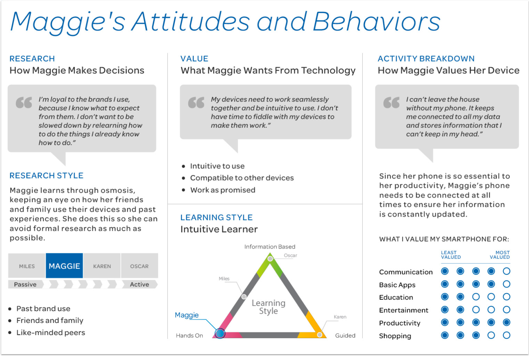
Maggie's Journey through AT&T
Using the existing persona of “Maggie”, we created two distinct scenarios, user paths and customer journeys through the AT&T shopping experience. The first saw Maggie shopping for internet service and the second as an established AT&T customer. Through both of the journeys we looked for opportunities to use data intelligently to personalize the experience for Maggie.
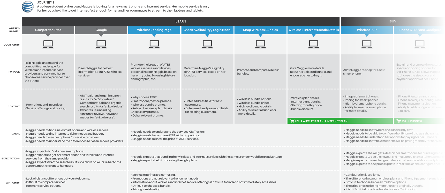
Customer Journey 1
“A college student on her own, Maggie is looking for a new smart phone and internet service. Her mobile service is only for her, but she’d like to get internet fast enough for her and her roommates to stream to their laptops and tablets.”

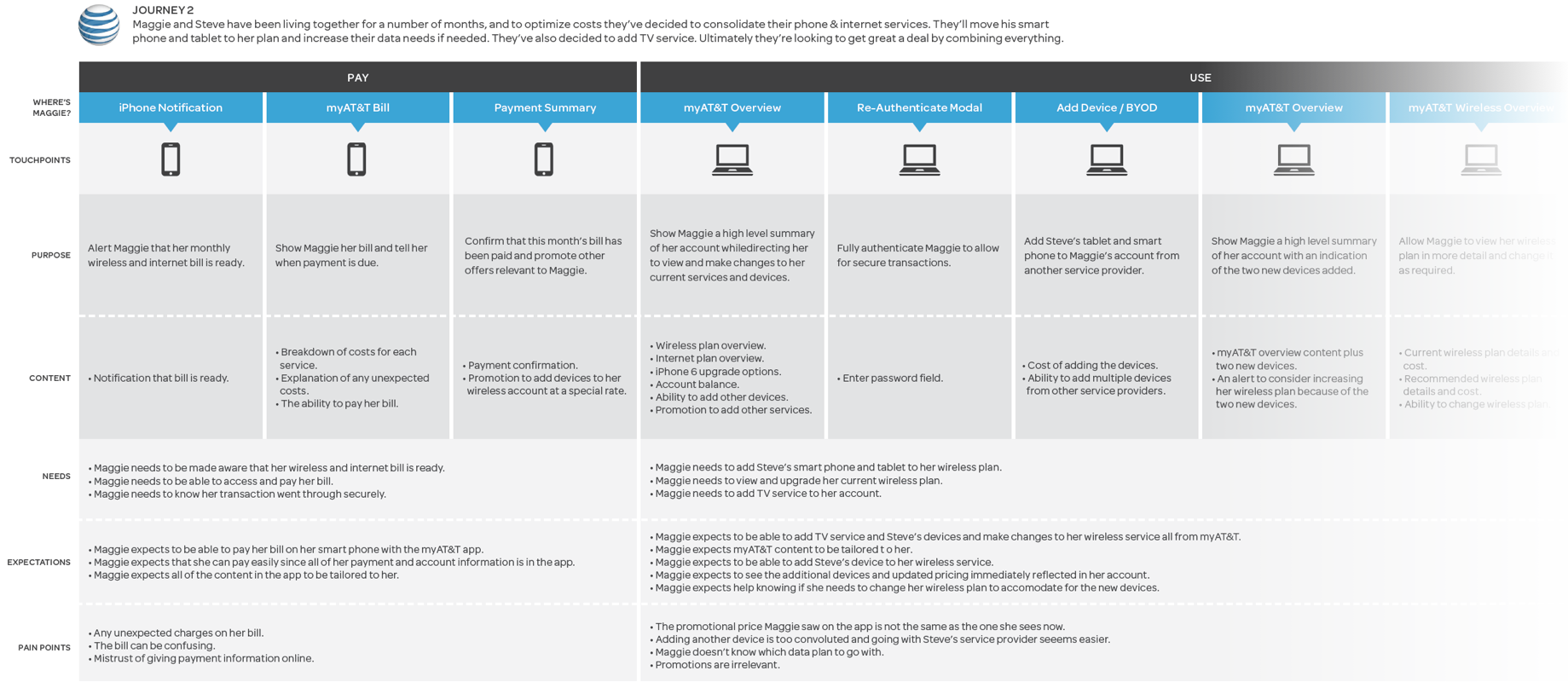
Customer Journey 2
“Maggie and Steve have been living together for a number of months and, to optimize costs, they’ve decided to consolidate their phone and internet services. They’ll move his smart phone and tablet to her plan and increase their data as needed. They’ve also decided to add TV service. Ultimately, they’re looking to get a great deal by combining everything.”

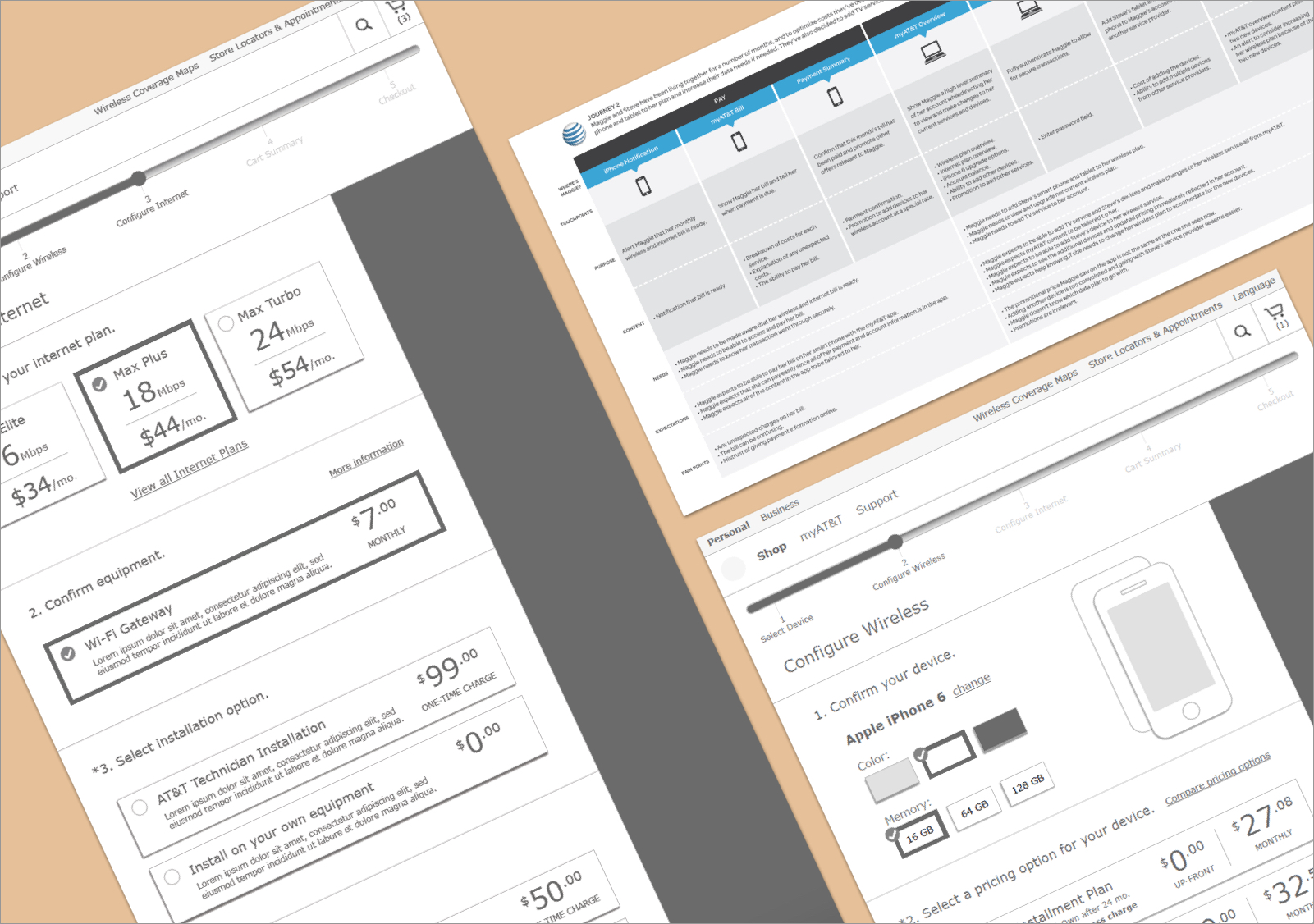
Navigation & Configuration
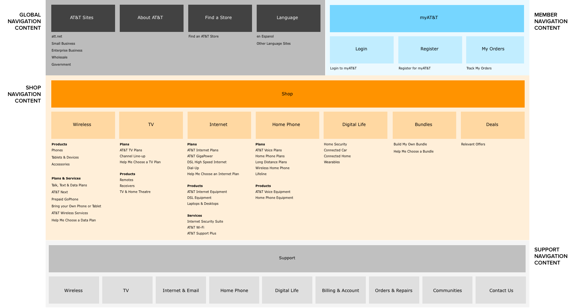
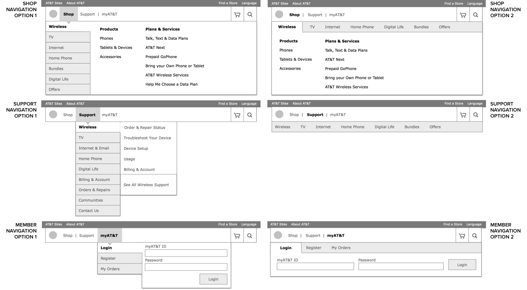
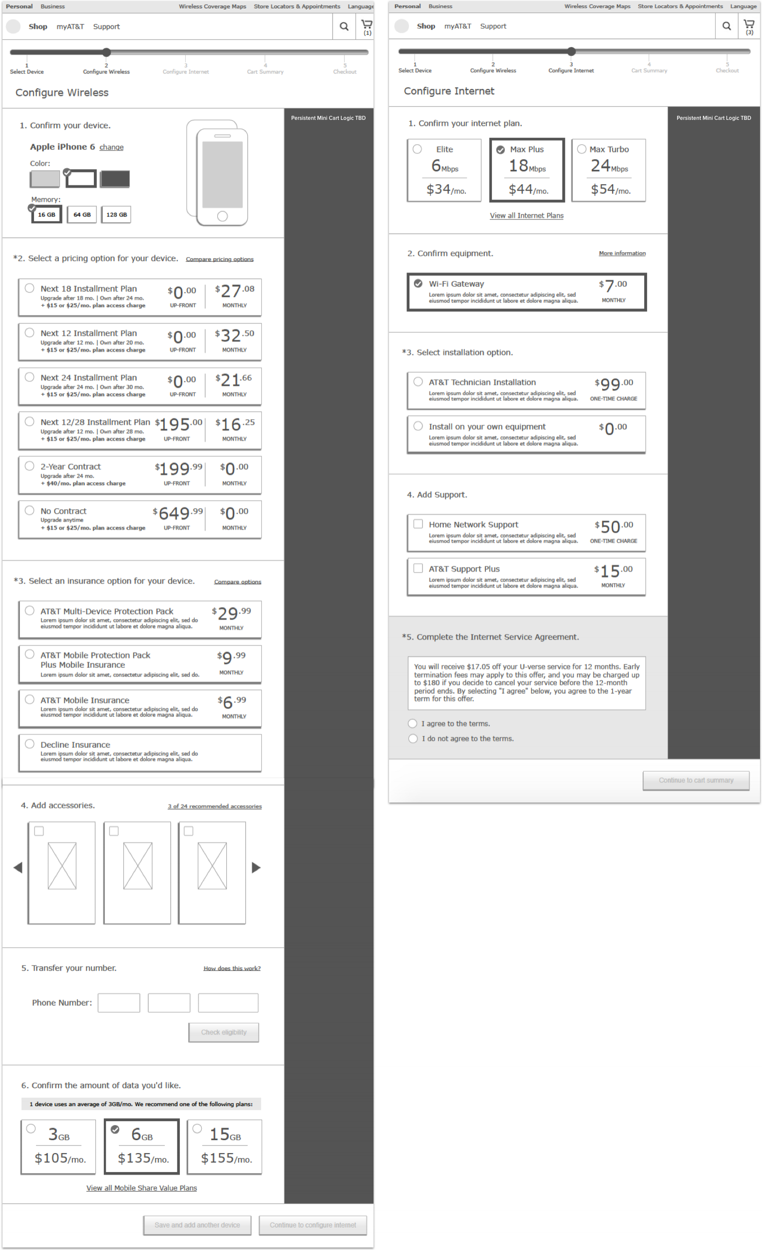
Additionally, as the vision came together, I audited the existing ATT.com navigation structure and content to provide a refined navigation recommendation. I also worked out what an optimized configurator and checkout flow could look like and wire framed key screens for the process.
Unfortunately, I’m unable to share the final vision materials, but hope these selections from my process give you an idea of the depth of work involved.
Credits
Client
AT&T
Agency
Critical Mass
User Experience
Chelsea Watson, Joanna Gee, Erik Fields
Strategy
Russ Rickey, Shawn Thompson, Aly Hasham
Art Direction
Cam Benedict, Jaymie Senga