
Blue Shield Member App & Responsive Site | Chelsea Watson, UX Designer
Explore Chelsea Watson’s UX design process for the redesign of the Blue Shield of California responsive site and member app including sketches, wireframes, user flows, content models and digital strategy documents.

Blue Shield of California Member Experience
Blue Shield of California is a not-for-profit health insurance provider based in San Francisco with over 4 million members across California. A massive organization bogged down in process, they were struggling to keep up with healthcare disruptors and emerging digital innovations.
The First Challenge
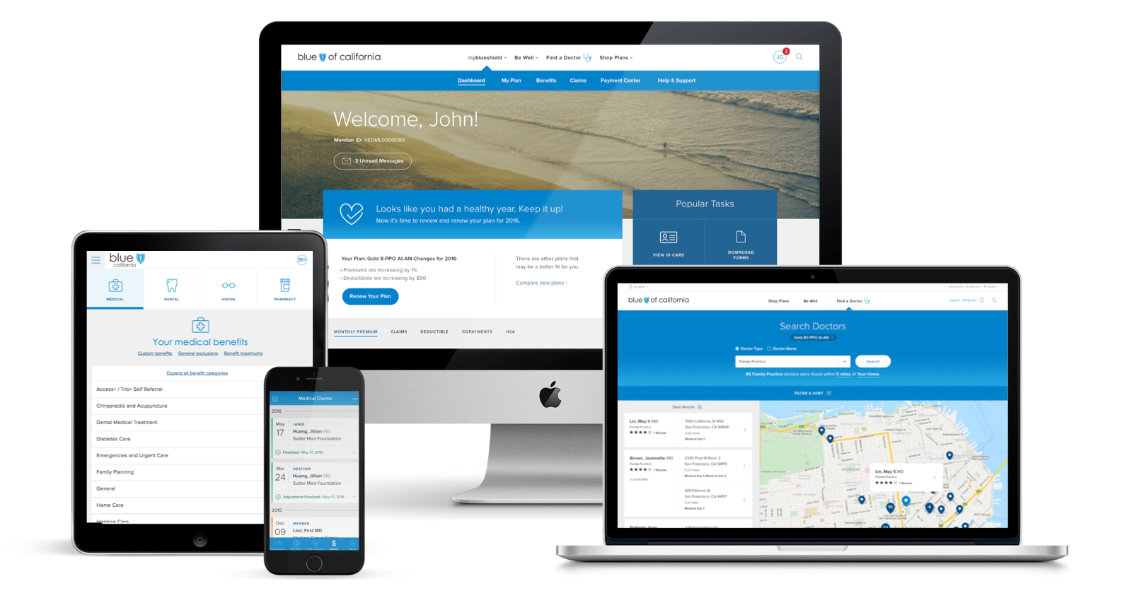
Despite the need for a digital overhaul, Blue Shield was nearing their annual enrolment period and we couldn’t risk blowing up their site. To mitigate this, we did extensive research into the site’s existing capabilities and launched a re-skinned responsive experience, as well as iOS and Android apps, all within the technical confines of Blue Shield’s backend services.
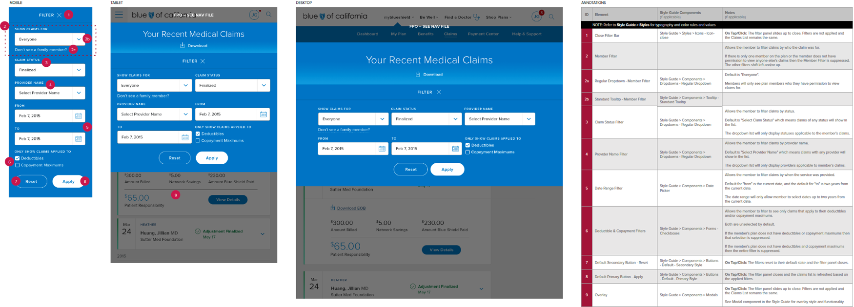
The project was broken into sprints to redesign the core member experiences including Login, Find a Doctor, Claims, Benefits, My Plan, ID Card, Dashboard and Profile. I lead a four person UX team to develop the navigation system, page layouts and overall digital strategy for both the responsive website and native mobile apps. Deliverables included extensive wireframes, annotations, user flows and prototypes.
View the iOS app Axure prototype
View the Android app Axure prototype
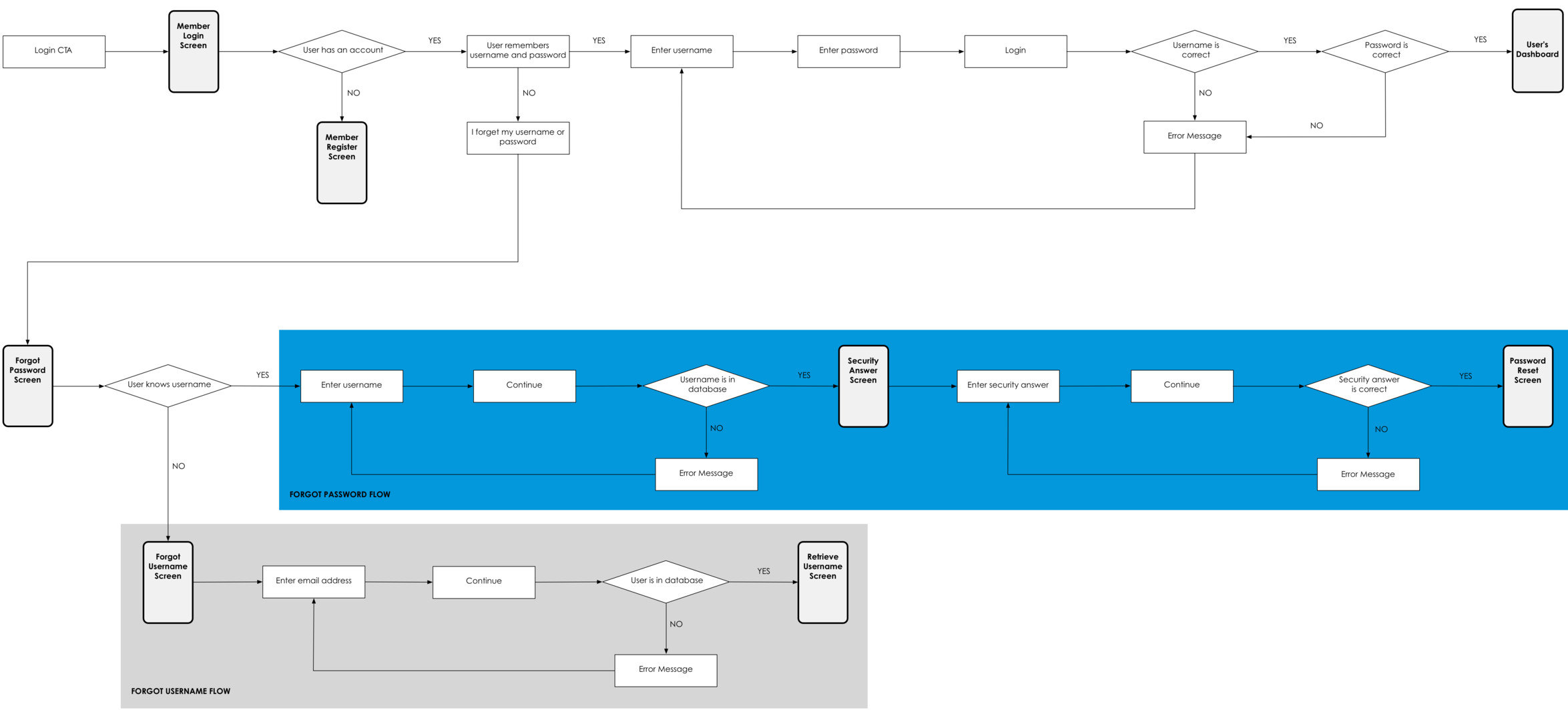
Login User Flow

Excerpts from the Navigation Strategy
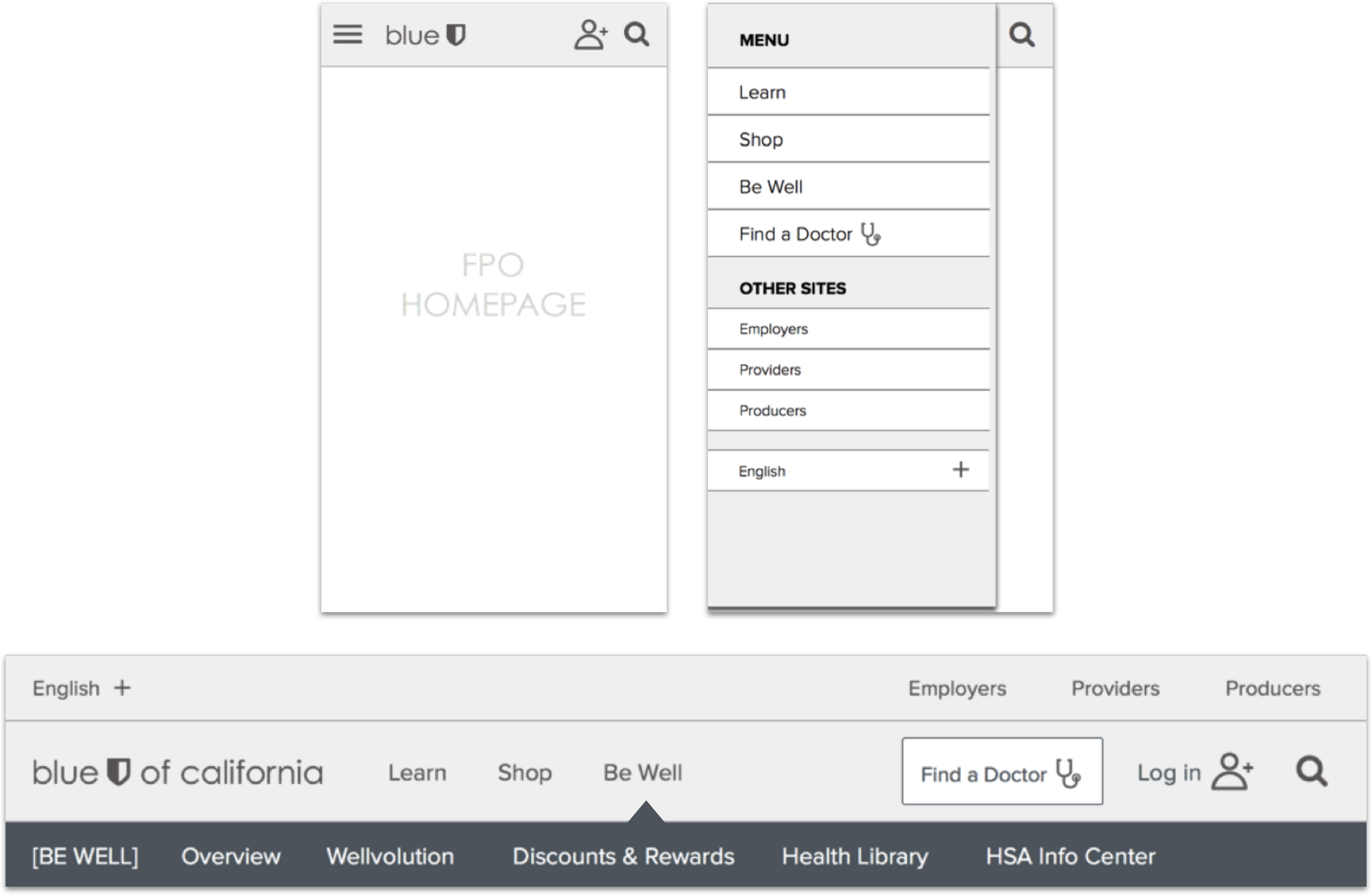
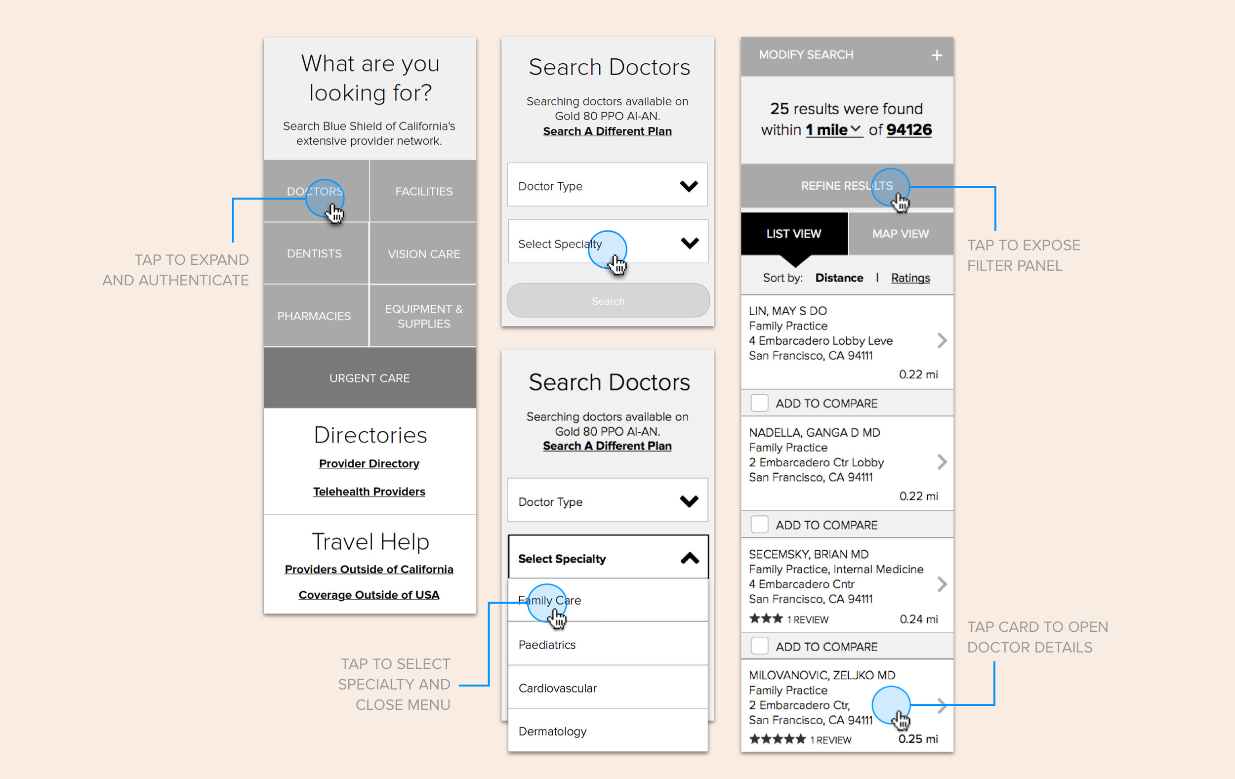
Wireframe and Annotation Samples
Blue Shield Redesign
The Blue Shield of California redesign is leaps and bounds beyond their previous digital experience. A reorganized navigation and intuitive user experience helps customers easily manage their plan, track their claims, find benefits or get urgent care, and the redesigned prospect experience incorporates Blue Shield’s new brand positioning, more effectively driving new customers to find a plan that best suites their needs.

The Next Challenge
Benefits is one of the most visited sections of the site as it is where Blue Shield members can see what they’re covered for. Unfortunately, because of how the backend data was structured, Benefits remained confusing and overwhelming, even with the help of the redesign. Blue Shield needed a vision of how to optimize their Benefits experience going forward.
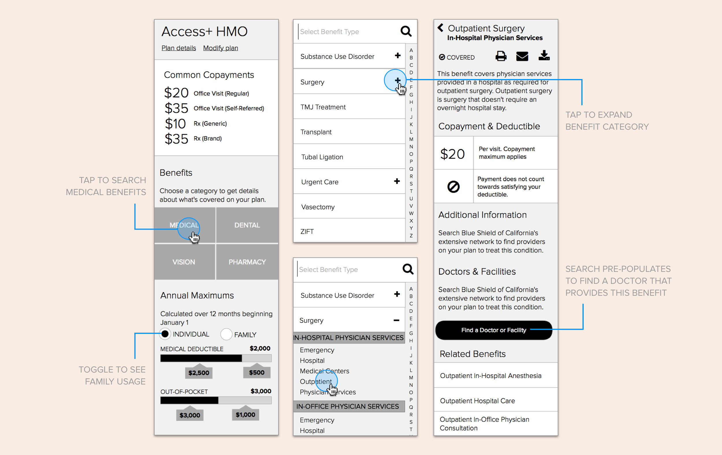
Benefits Vision Strategy
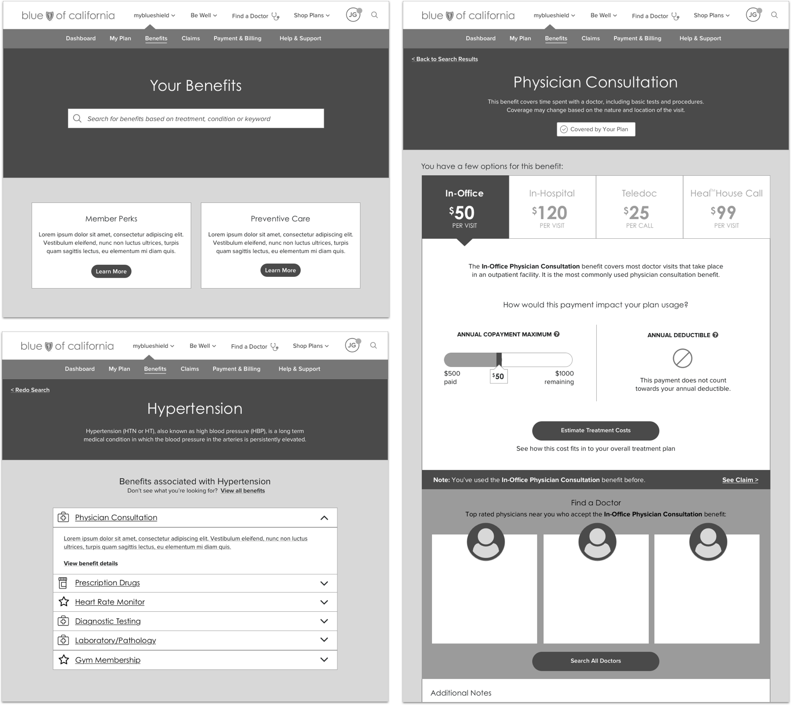
Working closely with a Designer and Strategist, I researched members, competitors and best in class digital experiences to help develop our strategy. To illustrate how the Benefits experience could evolve, we determined short, medium and long term solutions based on a scenario for our established member persona, which I storyboarded, sketched and wireframed to illustrate our concepts.


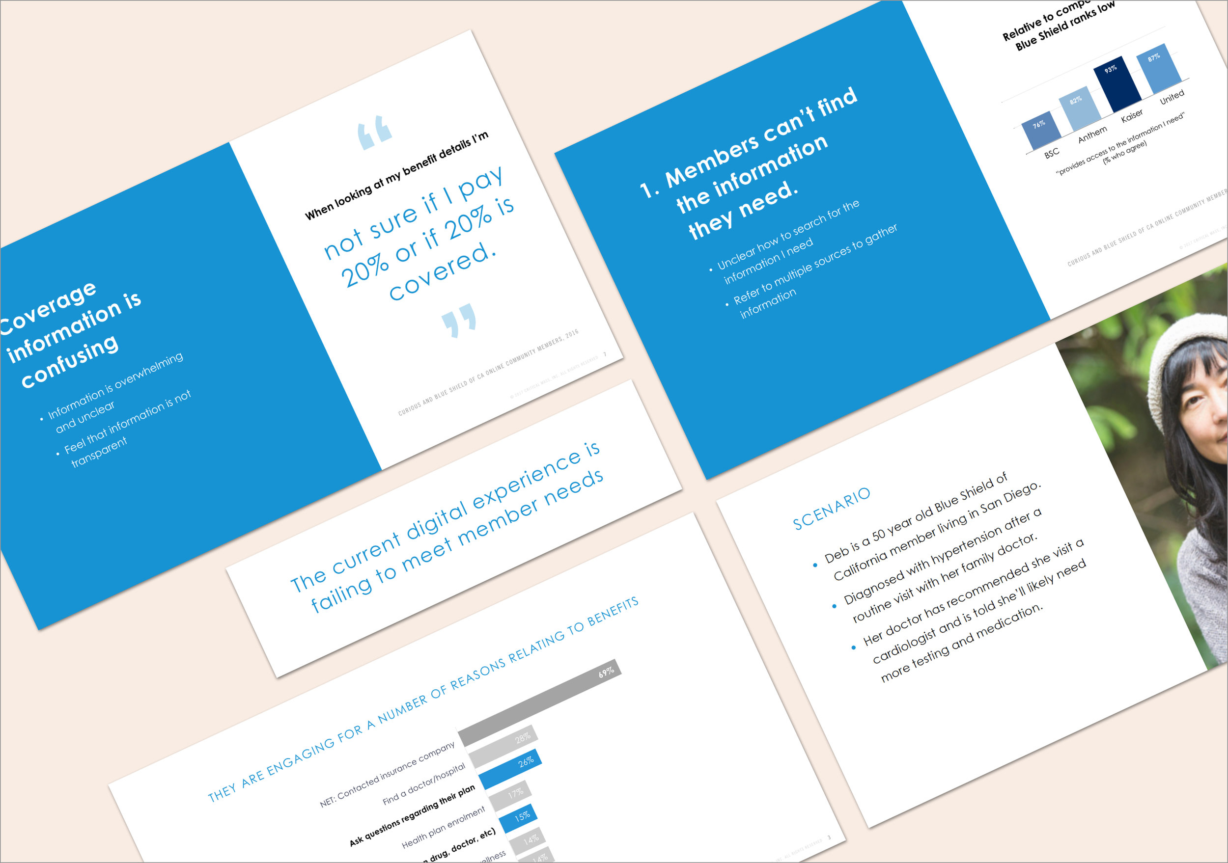
Short Term Benefits Vision
The immediate vision layers on top of the existing experience to provide easy access to a curated list of benefits associated with the most frequently searched conditions. We’ve also taken a step towards using more human friendly language. While we all agreed this experience was far from ideal, it was a necessary first step in making benefits easier to navigate for users.
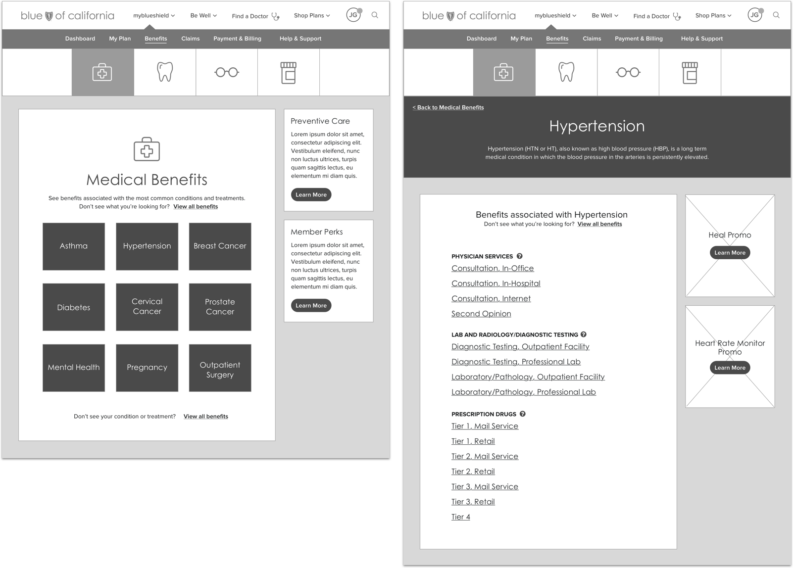
Medium Term Benefits Vision
Looking further in the future, we proposed implementing a more robust search, allowing members to find a benefit based on condition, treatment or keyword. We also simplified benefit categorization and grouping, and provided contextual information regarding claims, doctors and member perks.
Long Term Benefits Vision
The long term vision was the ideal benefits experience, simple, human and intelligent, designed based on member needs rather than on antiquated backend services. Along with the design, we proposed a roadmap for our client, illustrating how incremental optimizations could eventually get the Blue Shield benefit experience to our ambitious long term vision.

Team
Client
Blue Shield of California
Agency
Critical Mass
User Experience
Chelsea Watson, Joel Goldberg, Marnie Williamson, Mike Pardy
Strategy
Russ Rickey, Steph Schlachter
Creative Direction
Andrew Zoller
Design
Sarah Chou, Lin Oosterhoff, Joel Harding, Sam Benesh