Visa Intranet App & Responsive Site | Chelsea Watson, UX Designer
See how Chelsea Watson’s UX work impacted the award-winning Visa Intranet redesign.

Visa Intranet
Visa is a global financial service corporation headquartered in Foster City, California with nearly 20,000 employees worldwide. We were engaged to work with Visa after research revealed that nearly half of its workforce felt frustrated or ineffective on the job.

The Challenge
Visa needed to develop an employee-first intranet that would fundamentally transform the employee experience by reducing frustration, increasing productivity and eliciting genuine delight to become the cultural heart of the organization.
What began as the Insite app, a mobile companion to the previous employee experience, quickly grew into a full responsive redesign of the entire Visa intranet.

Employee First // Mobile First
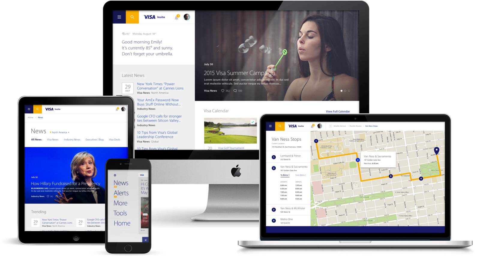
Our initial ask centred around a mobile iOS app dreamed up by one of Visa’s tech leads to supplement the existing intranet experience. As such, this mobile first approach allowed us to solution for small screens, creating a hyper-contextual, personalized experience and culling much of the existing content to focus on what matters most to employees.
Through extensive user research, we managed to determine the key tasks Visa employees used their intranet for and translated these into mobile tools such as a shuttle schedule, cafe menu, holiday calendar, employee search, and a system to identify and interact with colleagues around you.

Creative Solutioning
We were challenged by Visa to not only create a useful experience, but to delight employees to compete with all those other Silicon Valley employers - no easy task. We pushed ourselves to think outside the box and challenge typical patterns, while still creating an extremely user friendly experience.

Responsive Web Experience
The responsive intranet redesign was on a parallel fast-follow design path with the app. Our team took our learnings from the app design and made decisions as we went how experiences would scale as they shifted from a native app to a large screen experience.
We spoke continually with employees to better understand what they most wanted to achieve on Insite, and used our findings to prioritize the content and features that matter most. At every turn, we simplified Visa’s intranet into a more relevant, cohesive and human experience, pushing our clients to test early, test often, and make decisions based on employee needs rather than stakeholder wants.

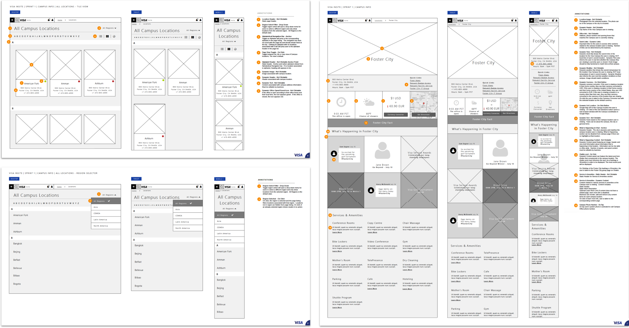
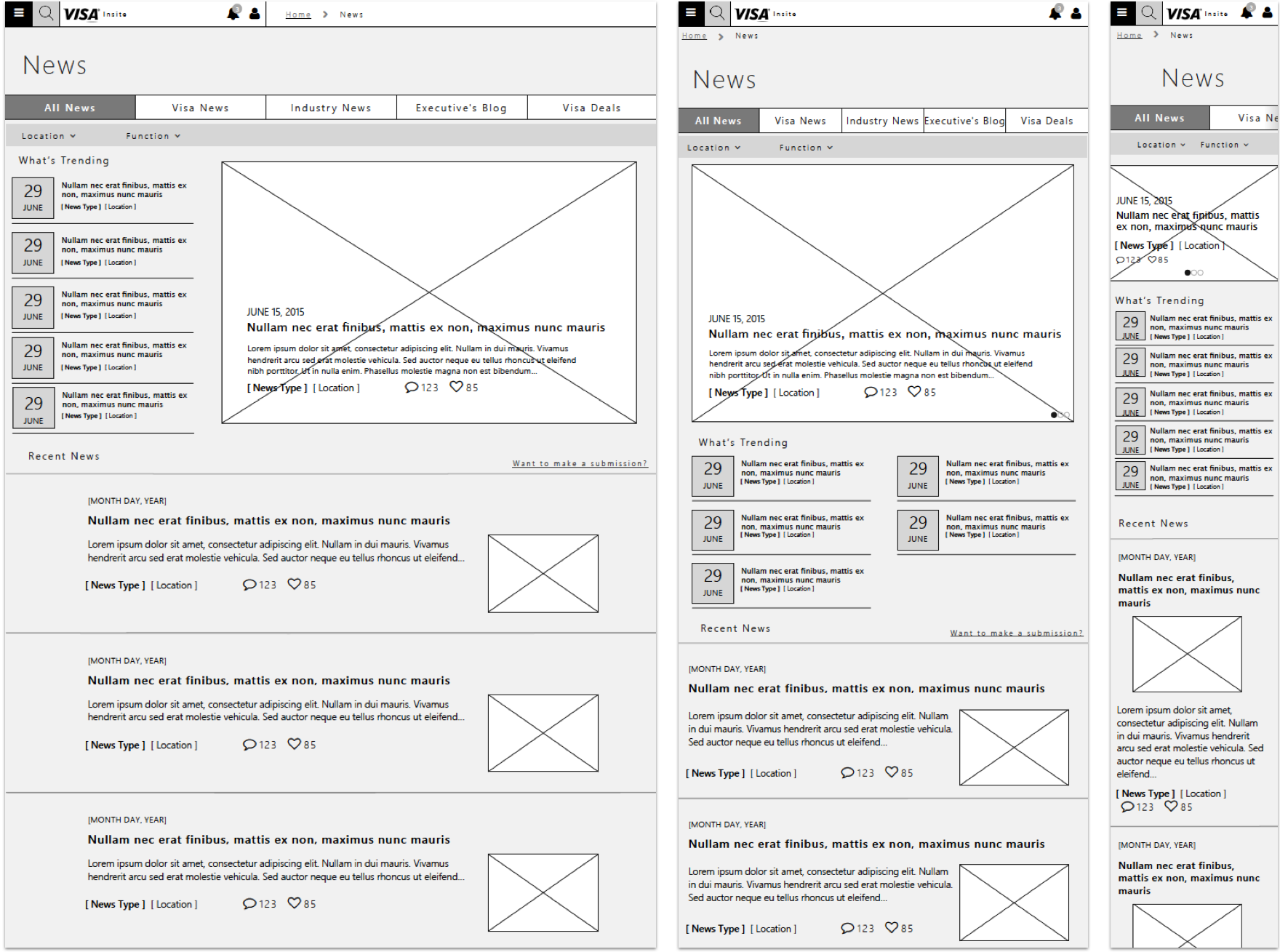
Wireframes for Location / Employee Group Details & the News Experience

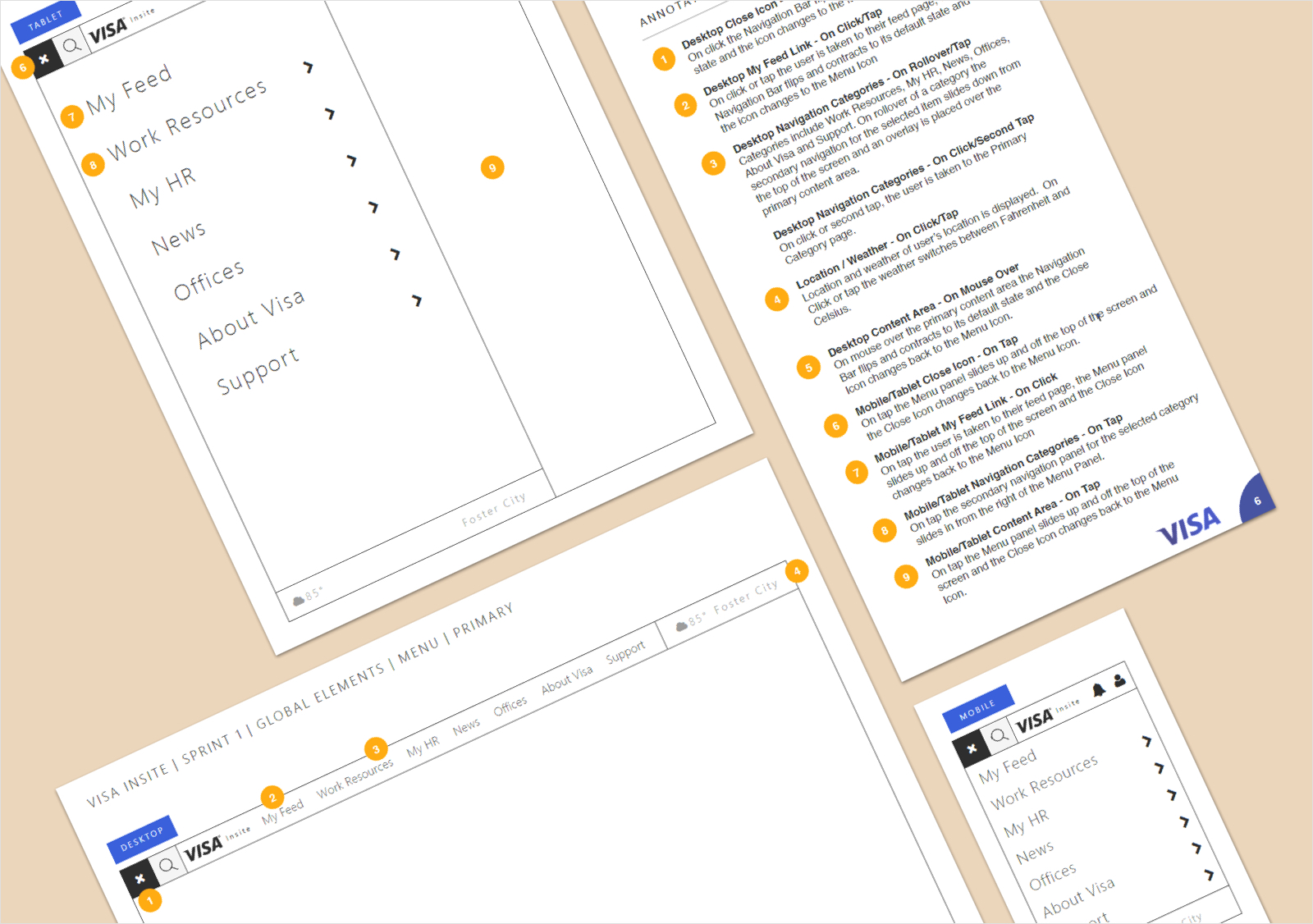
Excerpts from the Interaction Model Handbook

Documentation
When it came time to handoff our designs, I worked closely with the off-site development team to ensure everything functioned the way it was intended. Documentation included a 400-page annotation guide, wireframes for all breakpoints and interaction models for key experiences.

Annotated Wireframe Samples

Results
The redesigned Visa intranet experience combines relevant tools, news, social connections, work portals, alerts, and more - all in one simple, seamless and delightful experience. The hard work paid off as Visa took first place in the Design category of Ragan’s 2016 Intranet Awards, with honourable mentions in the Re-launch and Intranet Usability categories.

Team
Client
Visa
Agency
Critical Mass
UX Design
Chelsea Watson, Allison Mansell, Natalie Christensen
Visual Design
LeeJay Dunphy, Colin Stange
Content Strategy
Teresa Wong